Spring Into Digital Photography: First Look
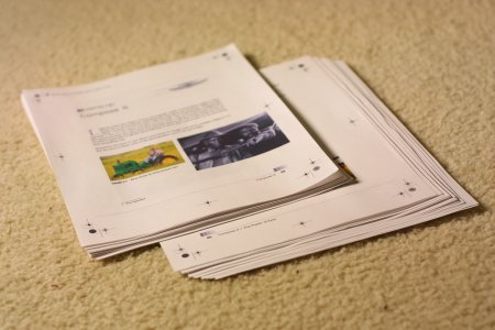
Is Spring Into Digital Photography just another book in the recent digital camera explosion? Perhaps, I can't tell for sure yet because I only have "Chapter 2: Compose It" from the book (see "Related Links" below to download your own copy of this chapter). A few weeks ago, the publisher, Addison-Wesley, asked if I would review their new book on my site. I said I would, so they sent me the soft copy for chapter 2, while the book is in the mail. So in this first look review, I will rave and rant on the pre-production chapter 2 on composition. When I get the actual book, I will write a more in-depth on the actual book.

Composition is a very important part of photography. In fact, it's probably more important than having great cameras and great lenses. Without composition, there is no story to tell. So any photography book that covers composition is OK by me.
On the other hand, Spring Into Digital Photography may be an exception because its chapter 2 is not a very good start. Between page 59 and page 71, the book covered the basic elements of composition: line, shape and form, pattern, texture, and color. Between these thirteen pages, there are ten pages of pictures and a total of three pages worth of text. Needless to say, the first part of chapter 2 tries to teach the concept of composition by example. You might think that the text must be short, concise, and to the point. Unfortunately, the text is filled with so many intended puns, overused cliché and clever wordplays that it sounds more like a run-on riddle. For example, on the first page of chapter 2, the authors had a footnote of "1. Pun intended."

I was a little more impressed after getting pass the thirteen pages of basic composition elements because the text to photos ratio seems quite a bit higher. I found the added textual content really help emphasize the photo examples. And I hope the rest of the book is more textual. Keep in mind that the number of picture real estate is still greater than the textual real estate throughout rest of the chapter.
Still, the clever writing continues. For example, the authors tried to explain the concept of tight cropping by comparing it to diamond cutting. Did the authors really think that their audience would understand more about diamond cutting than photo cropping? In the very next paragraph, the photographic frame is compared to the artist's canvas. For a artist, it's probably a great example, but for those with no artist background, it's just another dive into the rabbit hole. Perhaps, I'm just not as sophisticated as the typical consumer nowadays.
Eventually, the second part of chapter 2 became more substantial in both words and illustrations. Its "The Power of Eyes" and "The Power of Contrast" sections provide step-by-step description of how the eyes travels through the photo frame. These sections really help explain the concept of catching the viewer's attention. "A More Interesting Angle" section provides some good pointers for beginner photographers on getting more interesting perspectives. Each individual sections are short and terse, taking up only two pages.
Overall, this book is great for people who rather learn by examples than by reading. This book is geared for photographers who have at least a little bit of photographic experience. It does a good job reminding them of photographic concepts. Its terseness makes this book a good quick reference. However, a consumer diving into digital photography will have problems deciphering its riddles and clever writings.
Related Links
- Addison-Wesley Professional Publishes New "Spring Into" Series
- Compose It - Free chapter from Spring Into Digital Photography
- Spring Into Digital Photography - Amazon User Reviews
$10000-above
$5000-$9999
$2000-$4999
$1000-$1999
$500-$999
$200-$499
$100-$199
$50-$99
$25-$49
$0-$24
Gift Certificate

