Older Revision of Creating Upset Soul on Instagram
Revision: 20140920_060115 | All Revisions
Creating Upset Soul on Instagram
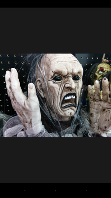
In this example article, we will explain how we created the "Upset Soul" Halloween photo. We will provide step-by-step tutorial and screen shots of the posting processing. We will change a typical shot of a Halloween prop into one that is scary, spooky, and worthy of the darkness of All Hallows' Eve (see transformation photos below). And we do it all through Instagram on Android.
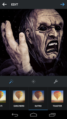
This article is an example within the series of "Creating Dramatic Halloween Photographs on Android".
Step-By-Step Transformation
First we are going to select the image from Android Gallery. And the image (see below) we select is the topic of this article. As you can see from the image below. It's a little too uniformly bright that really doesn't scream awesome Halloween! Even the shelving is visible in the background to throw away a chance of feeling mysterious. Personally, I feel this image could use the Picasso look.

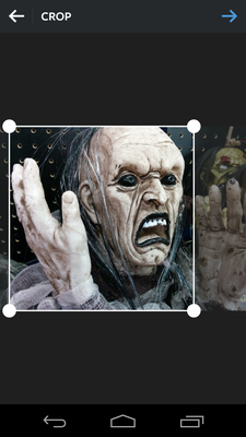
Share the image with Instagram. Instagram only allow square photos, therefore, it gives you a chance to crop the image (see screen shot below). We are going to take advantage of Instagram's crop capability to really tell the story, which is an anguish scream. The clutter on the right doesn't help tell that story. The hand on the left, however, is perfect. So we crop to keep the hand and the face as shown in the photo below.
Some of you would say that it's technical photo to have the subject looking outside the photo. But this distressing feeling is the exact technique we want to use to tell the story of an upset soul. We want the audience to feel the subject.
Ok. Earlier I complained about the uniform lighting. Using the Vignette function (see screen shot below), we can reduce the brightness to the corners, which helps the audience focus on the center of the image, where the subject is. I pumped vignette all the way up. The artificial shelving is starting to fade away.
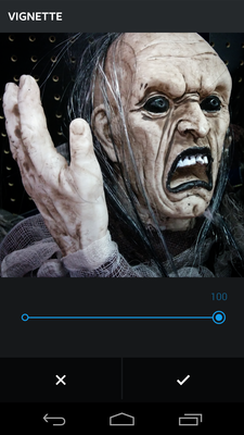
The slightly reduced lighting, from the vignette, to the face also eliminated the super bright skin, commonly used for woman's glamor portrait. The darker skin tone emphasized skin defect to give him a more ghoulish look.
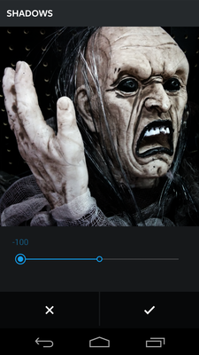
Next, we are going to really get rid of the the shelving and emphasize the darkness of the image. That can be accomplished with the "Shadows" function (see screen shot below). As you can see dragging the Shadows adjustment all the way to the right brought out the black in black; Everything in the dark area just turned more black! By emphasizing the shadows on the face, the subject is now really screaming anguish-like. We are also finally getting somewhere with the background shelves. I bet you almost forgotten about them until I just brought them up.

166 Users Online
|
$10000-above $5000-$9999 $2000-$4999 $1000-$1999 $500-$999 $200-$499 $100-$199 $50-$99 $25-$49 $0-$24 Gift Certificate |
|


